Design
2014
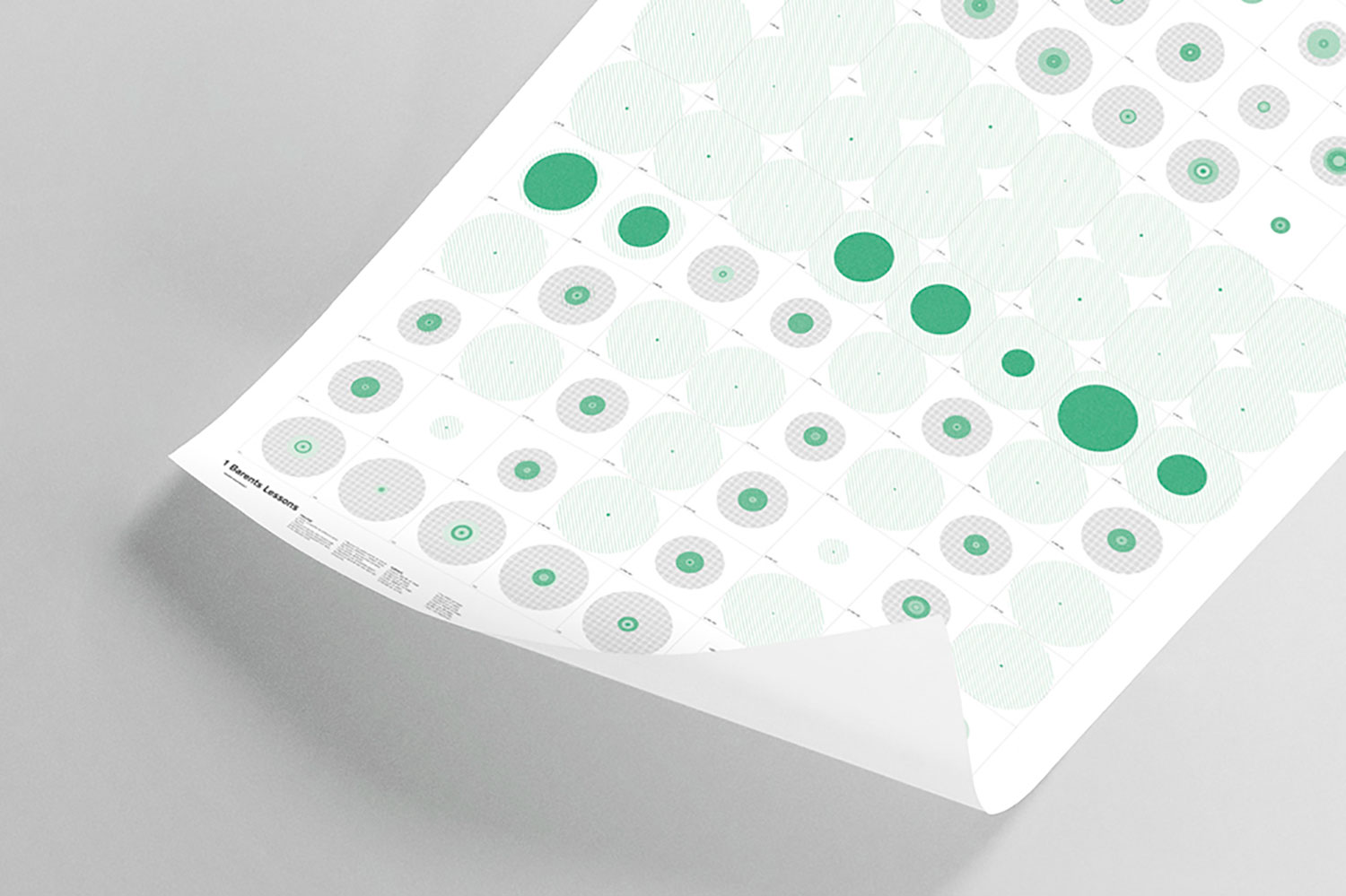
Barents lessons analysis
Data Design Poster
This series of posters has been produced according to a strict procedure: measuring and calculating, on each page, the proportion of space shared by graphics, photographs and text in its different styles. The four parts of the book with different surfaces - Analysis, Maps, Trip, Project - and their data were given to the same surface.
The objective of the Barents Lessons Analysis project is therefore to represent, through data design, the composition of the Barents Lessons book.


